A big visual overhaul for the benefits program of customers from both Vodafone and Ziggo
Summary
Intro
In a fast-changing market, standing out means more than just offering good service. Vodafone and Ziggo wanted to show extra appreciation to their loyal customers. The idea was simple: if someone uses both services, they deserve something in return. But as the program grew, the design didn’t keep up. It needed a clearer and more modern way to tell its story one that would catch the eye and make people understand the value instantly.

Challenge
The main challenge was giving the program a new look that still respected the visual styles of both Vodafone and Ziggo. That meant finding the right balance between two brands while also creating something that felt fresh, appealing, and easy to understand. The design needed to work across both digital screens and printed materials. Most importantly, it had to help customers quickly see the benefits and feel excited about them.
My Role
I was responsible for redesigning the visual identity of the program. This included creating a new logo, colors, icons, and layout. I redesigned the landing page and all the benefit pages to make them easier to use and more visually engaging. I also worked closely with a photographer to create images that matched the updated style and helped bring the perks to life. On top of that, I designed all the assets needed for online and offline campaigns, so everything looked consistent no matter where people saw it.
Approach
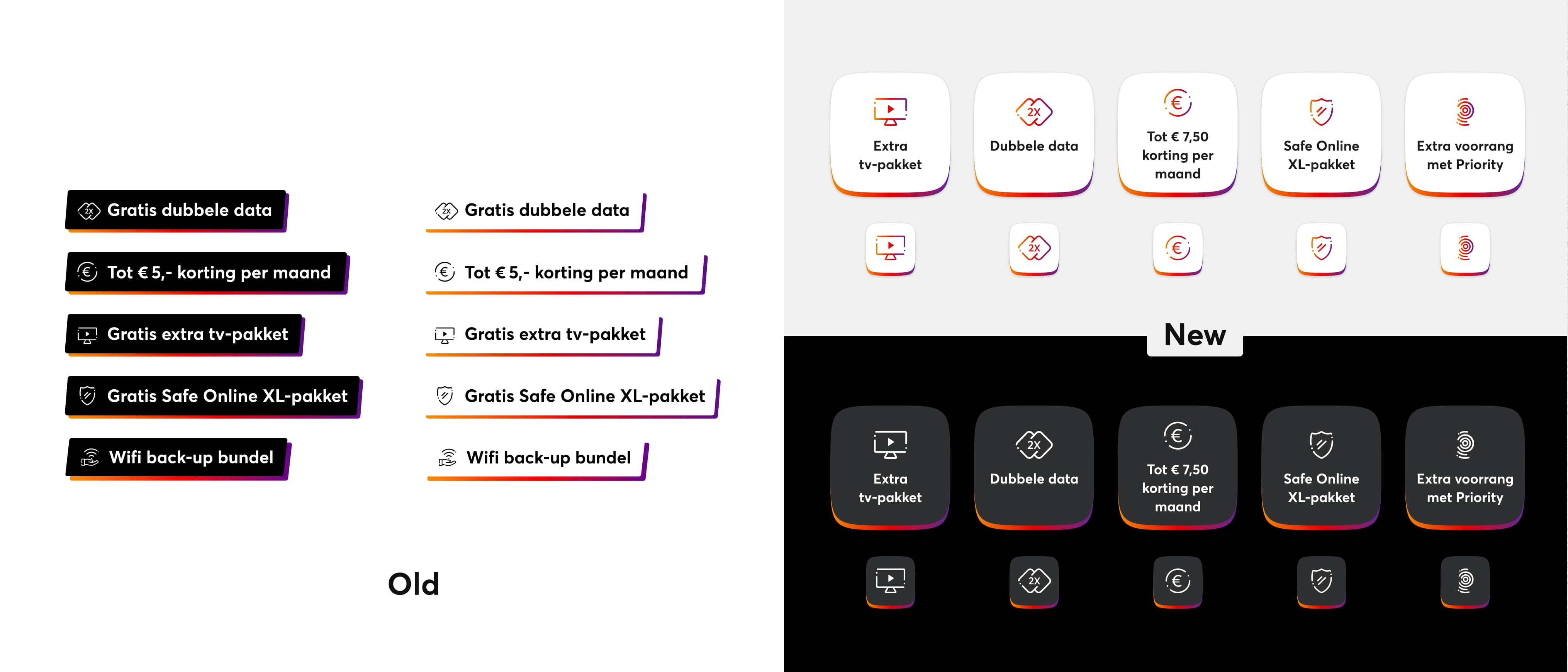
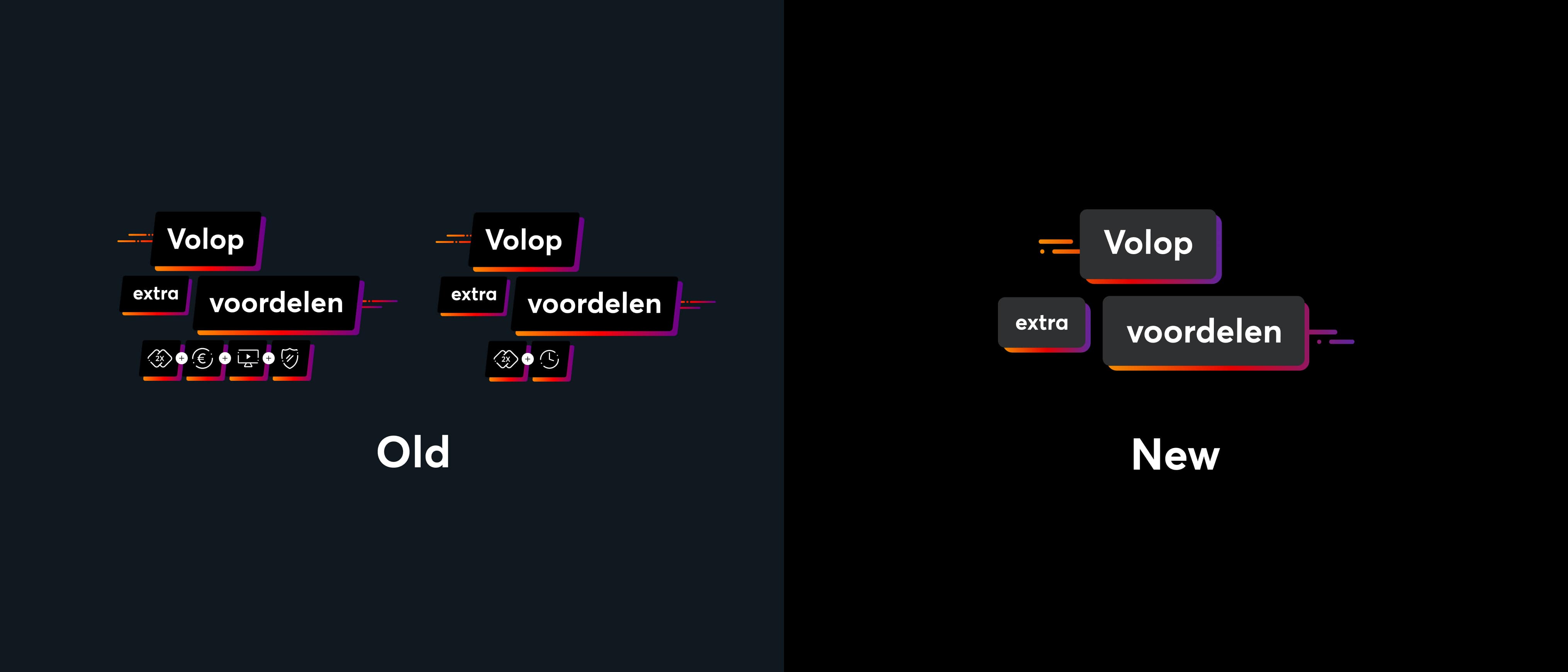
We started by replacing old visual elements with more modern and flexible ones. For example, the outdated panels were replaced by colorful “benefit stickers” that could be used in different formats and still look good. These were easy to scale and adapt for different devices and campaign types.
Next, I focused on making sure the design respected the visual rules of both brands. This required careful choices around colors, typography, and layouts so the program could still feel like a natural part of Vodafone and Ziggo’s overall branding.
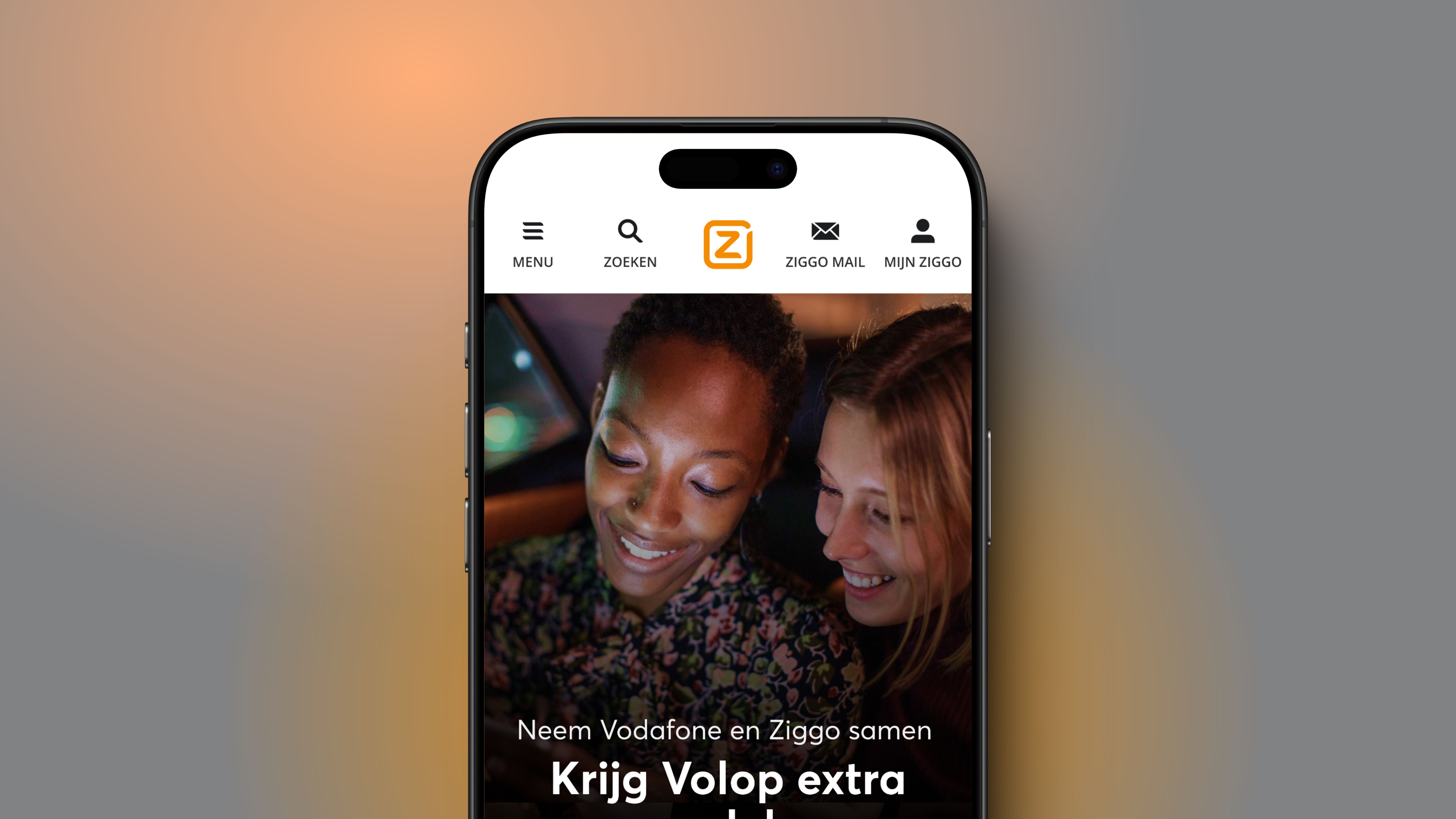
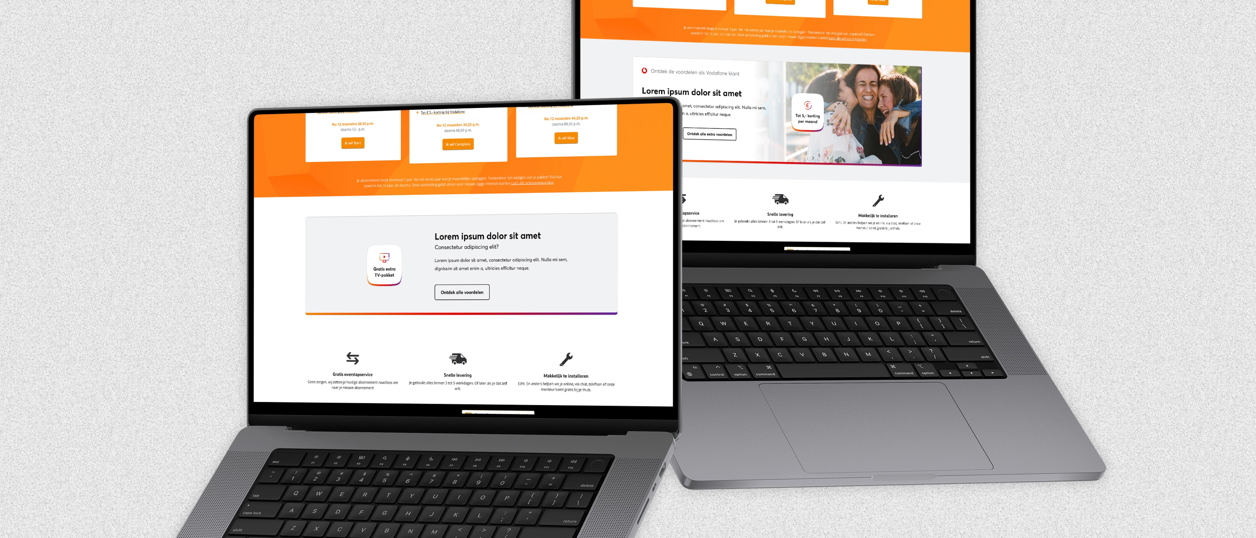
The website also got a full refresh. The landing page and all related pages were redesigned to be easier to use, with clear explanations of the benefits and visuals that helped people connect the offer with real-life rewards. Working with a photographer allowed us to capture scenes that felt relatable and matched the new look. This gave the campaign a more human, everyday feel that made the perks seem more real and valuable.
Finally, I made sure all designs were flexible and ready to be used in different formats—from banners and posters to emails and mobile screens. Everything was created with reusability in mind, so the marketing team could roll out new versions without starting from scratch.
Conclusion
Redesigning the “Volop Extra Voordelen” program was a great experience. It proved how much impact a strong and user-friendly visual identity can have. By focusing on clarity, flexibility, and consistency, we made the program feel more modern and engaging. And for customers, it became easier to understand what they were getting and why it mattered.